
Message Blocks
Introduction
Each MedChat message contains a body, and that body consists of a collection of message blocks. This guide will introduce developers to the available block type models. A separate, more detailed guide will offer additional information on valid message compositions.
NoteWe are actively expanding the list of available message block types. Check back often to see what new options are available for tailored messages.
Text Messages
The simplest block type in the MedChat model is TextMessageBlock. It is the most common block type, used any time patients or agents send text messages via the UI.
{
    ...
    "Body": [
        {
            "Id": "OptionalId",
            "Type": "TextMessageBlock",
            "Text": "Hello world! How are you?"
        }
    ],
    ...
}
Here is what this single-block example message would look like to the user.
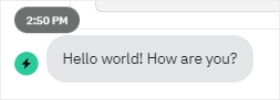
Rendered TextMessageBlock Example
Input Controls
MedChat supports a range of input controls inside our message models. These input block types are generated whenever an agent sends a form or when a chat bot asks a question of the user.
Text
TextInputMessageBlock is the basic text input control. It is used for short answer questions.
{
    ...
    "Body": [
        {
            "Id": "SomeId",
            "Type": "TextInputMessageBlock",
            "Label": "What is your favorite sport?",
            "Placeholder": "Type your answer",
            "IsPrivate": false,
            "Validators": [
                {
                    "Type": "RequiredInputMessageBlockValidator"
                },
                {
                    "Type": "TextLengthInputMessageBlockValidator",
                    "MaxLength": 50
                }
            ]
        }
    ],
    ...
}
Rendered TextInputMessageBlock Example
Secret
SecretInputMessageBlock is a specialized text input that masks sensitive user input.
{
    ...
    "Body": [
        {
            "Id": "SecurityQuestion1",
            "Type": "SecretInputMessageBlock",
            "Label": "What was the first concert you attended?",
            "Placeholder": "Answer",
            "IsPrivate": true,
            "Validators": [
                {
                    "Type": "RequiredInputMessageBlockValidator"
                }
            ]
        }
    ],
    ...
}
Paragraph
The ParagraphInputMessageBlock is identical to the TextInputMessageBlock except that it provides a larger input control for multi-line responses.
{
    ...
    "Body": [
        {
            "Id": "SomeId",
            "Type": "ParagraphInputMessageBlock",
            "Label": "What are your long term professional goals?",
            "Placeholder": "Type your answer",
            "IsPrivate": false,
            "Validators": [
                {
                    "Type": "RequiredInputMessageBlockValidator"
                },
                {
                    "Type": "TextLengthInputMessageBlockValidator",
                    "MaxLength": 500
                }
            ]
        }
    ],
    ...
}
Rendered ParagraphInputMessageBlock Example
Drop Down
The first of our multi-option input controls is the DropDownInputMessageBlock. It may be used in a single or multi-select context. Additionally, it may be configured to accept custom input (i.e. the user is able to specify an option outside the preconfigured list). When the drop down is expanded, the user has access to a search bar to quickly narrow the choices.
{
    ...
    "Body": [
        {
            "Id": "SomeId",
            "Type": "DropDownInputMessageBlock",
            "Label": "What is your favorite color?",
            "Placeholder": "Choose your option",
            "IsMultiSelectEnabled": false,
            "IsPrivate": false,
            "AllowCustomInput": false,
            "Options": [
                {
                    "Label": "Red",
                    "Value": "Red"
                },
                {
                    "Label": "Blue",
                    "Value": "Blue"
                },
                {
                    "Label": "Green",
                    "Value": "Green"
                }
            ],
            "Validators": [
                {
                    "Type": "RequiredInputMessageBlockValidator"
                }
            ]
        }
    ],
    ...
}
Rendered DropDownInputMessageBlock Example - Collapsed List

Rendered DropDownInputMessageBlock Example - Expanded List
Multi Choice
Our second multi-option input control is the MultiChoiceInputMessageBlock. Like the drop down control, it can also be used for either single or multi-select questions. The default display mode is "List", which shows a checkbox next to each of the options. The other display mode is "Buttons", which renders the options as a group of buttons. Multi-choice options also support an optional Description property.
{
    ...
    "Body": [
        {
            "Id": "SomeId",
            "Type": "MultiChoiceInputMessageBlock",
            "Label": "Which is the best Ninja Turtle?",
            "IsMultiSelectEnabled": false,
            "IsPrivate": false,
            "DisplayMode": "List",
            "Options": [
                {
                    "Label": "Leonardo",
                    "Value": "Leonardo"
                },
                {
                    "Label": "Raphael",
                    "Value": "Raphael"
                },
                {
                    "Label": "Michelangelo",
                    "Value": "Michelangelo"
                },
                {
                    "Label": "Donatelo",
                    "Value": "Donatelo"
                }
            ],
            "Validators": [
                {
                    "Type": "RequiredInputMessageBlockValidator"
                }
            ]
        }
    ],
    ...
}
Rendered MultiChoiceInputMessageBlock Example
Scale
For discrete numeric inputs, the MedChat model defines a ScaleInputMessageBlock. When answering the question, users may select one of the discrete values between MinValue and MaxValue, inclusive, using increments of the "Step" size. The scale input may render optional labels under the min and max values.
{
    ...
    "Body": [
        {
            "Id": "SomeId",
            "Type": "ScaleInputMessageBlock",
            "Label": "How satisfied are you with your service?",
            "IsPrivate": false,
            "MinValue": 1,
            "MaxValue": 5,
            "Step": 1,
            "MinLabel": "Unsatisfied",
            "MaxLabel": "Very Satisfied",
            "Validators": [
                {
                    "Type": "RequiredInputMessageBlockValidator"
                }
            ]
        }
    ],
    ...
}
Rendered ScaleInputMessageBlock Example
File Upload
Users can be prompted to upload a file by using the FileUploadInputMessageBlock. Files are currently restricted to a maximum size of 30 MB.
{
    ...
    "Body": [
        {
            "Id": "SomeId",
            "Type": "FileUploadInputMessageBlock",
            "Label": "Upload your resume",
            "Validators": [
                {
                    "Type": "RequiredInputMessageBlockValidator"
                }
            ]
        }
    ],
    ...
}
Rendered FileUploadMessageBlock Example
File Download
The FileDownloadInputMessageBlock provides a downloadable file link to users. This is typically used to share documents, forms, or other files with the patient. If the patient must download the file to proceed, configure a RequiredInputMessageBlockValidator.
{
    ...
    "Body": [
        {
            "Id": "SomeId",
            "Type": "FileDownloadInputMessageBlock",
            "Label": "Download the required insurance form",
            "AssetId": "123e4567-e89b-12d3-a456-426614174000",
            "FileName": "insurance_form.pdf",
            "Validators": [
                {
                    "Type": "RequiredInputMessageBlockValidator"
                }
            ]
        }
    ],
    ...
}
Date Picker
The DatePickerInputMessageBlock can be used for single date or date range entry/selection.
{
    ...
    "Body": [
        {
            "Id": "SomeId",
            "Type": "DatePickerInputMessageBlock",
            "Label": "Please enter your birthdate.",
            "Placeholder": "Select a date",
            "IsPrivate": false,
            "PickerType": "Single", // "Single" or "Range"
            "DateFormatOption": {
                "Example": null,
                "FormatString": "MM/dd/yyyy"
            },
            "DaysInThePastLimit": null,
            "DaysInTheFutureLimit": 0,
            "Validators": [
                {
                    "Type": "RequiredInputMessageBlockValidator"
                }
            ]
        }
    ],
    ...
}
Rendered DatePickerInputMessageBlock Example

Rendered DatePickerInputMessageBlock Example - Expanded
Time Picker
The TimePickerInputMessageBlock can be used for single time or time range entry/selection. It supports time validation and can be configured with time limits and intervals.
{
    ...
    "Body": [
        {
            "Id": "SomeId",
            "Type": "TimePickerInputMessageBlock",
            "Label": "What time would you prefer for your appointment?",
            "Placeholder": "Select a time",
            "IsPrivate": false,
            "PickerType": "Single",
            "TimeIntervalInMinutes": 15,
            "StartTimeLimit": "08:00:00",
            "EndTimeLimit": "17:00:00",
            "Validators": [
                {
                    "Type": "RequiredInputMessageBlockValidator"
                }
            ]
        }
    ],
    ...
}
For time range selection, set PickerType to "Range":
{
    ...
    "Body": [
        {
            "Id": "SomeId",
            "Type": "TimePickerInputMessageBlock",
            "Label": "Select your preferred time range",
            "Placeholder": "Select time range",
            "IsPrivate": false,
            "PickerType": "Range",
            "TimeIntervalInMinutes": 30,
            "Validators": [
                {
                    "Type": "RequiredInputMessageBlockValidator"
                }
            ]
        }
    ],
    ...
}
Gender
The GenderInputMessageBlock can be used for gender selection.
{
    ...
    "Body": [
        {
            "Id": "SomeId",
            "Type": "GenderInputMessageBlock",
            "Label": "Please select your gender.",
            "Placeholder": "Select gender",
            "IsPrivate": false,
            "Options": [
                "Female",
                "Male",
                "Unknown",
                "Other",
                "Nonbinary"
            ],
            "Validators": [
                {
                    "Type": "RequiredInputMessageBlockValidator"
                }
            ]
        }
    ],
    ...
}
Rendered GenderInputMessageBlockExample

Rendered GenderInputMessageBlockExample - Expanded
Phone Number
The PhoneNumberInputMessageBlock can be used for phone number entry. The block validates that the user-entered number is a properly formatted number, according to the selected country.
{
    ...
    "Body": [
        {
            "Id": "SomeId",
            "Type": "PhoneNumberInputMessageBlock",
            "Label": "Please enter your phone number.",
            "Placeholder": "Enter a phone number",
            "AllowInternational": true,
            "IsPrivate": false,
            "Validators": [
                {
                    "Type": "RequiredInputMessageBlockValidator"
                }
            ]
        }
    ],
    ...
}
Rendered PhoneNumberInputMessageBlockExample
Cards
The CardInputMessageBlock displays a selection of cards with images, allowing users to choose from visually rich options. This is ideal for appointment slots, service offerings, or product selections.
{
    ...
    "Body": [
        {
            "Id": "SomeId",
            "Type": "CardInputMessageBlock",
            "Label": "Choose your preferred appointment slot",
            "IsPrivate": false,
            "ImageLayout": "Top",
            "CardTemplateName": "AppointmentSlot",
            "CanSearch": true,
            "Cards": [
                {
                    "Id": "card1",
                    "Title": "Morning Slot",
                    "Subtitle": "9:00 AM - Dr. Smith",
                    "ImageUrl": "https://example.com/morning.jpg",
                    "Value": "morning_slot_1"
                },
                {
                    "Id": "card2",
                    "Title": "Afternoon Slot",
                    "Subtitle": "2:00 PM - Dr. Johnson",
                    "ImageUrl": "https://example.com/afternoon.jpg",
                    "Value": "afternoon_slot_1"
                }
            ],
            "Validators": [
                {
                    "Type": "RequiredInputMessageBlockValidator"
                }
            ]
        }
    ],
    ...
}
Signature
The SignatureInputMessageBlock captures digital signatures with optional terms acceptance. This is commonly used for consent forms, agreements, or legal documents.
{
    ...
    "Body": [
        {
            "Id": "SomeId",
            "Type": "SignatureInputMessageBlock",
            "Label": "Please sign the consent form",
            "IsPrivate": false,
            "ShouldIncludeTerms": true,
            "IsSignatureImageRequired": false,
            "TermsLabel": "Terms and Conditions",
            "TermsButtonText": "View Terms",
            "TermsUrl": "https://example.com/terms",
            "SignatureLabel": "Digital Signature",
            "SignaturePlaceholder": "Type your full name",
            "EmailLabel": "Email Address",
            "EmailPlaceholder": "[email protected]",
            "Validators": [
                {
                    "Type": "RequiredInputMessageBlockValidator"
                }
            ]
        }
    ],
    ...
}
When IsSignatureImageRequired is true, the widget will collect a hand-drawn signature from the patient.
Multiple Inputs
Each example so far has included only a single input block. However, the MedChat message body is an array of message blocks. Multiple inputs may be placed in a single message by including a block for each input.
{
    ...
    "Body": [
        {
            "Id": "OptionalId",
            "Type": "TextMessageBlock",
            "Text": "What is your mailing address?"
        },
        {
            "Id": "Street",
            "Type": "TextInputMessageBlock",
            "Placeholder": "Street",
            "IsPrivate": false,
            "Validators": [
                {
                    "Type": "RequiredInputMessageBlockValidator"
                }
            ]
        },
        {
            "Id": "City",
            "Type": "TextInputMessageBlock",
            "Placeholder": "City",
            "IsPrivate": false,
            "Validators": [
                {
                    "Type": "RequiredInputMessageBlockValidator"
                }
            ]
        },
        {
            "Id": "State",
            "Type": "TextInputMessageBlock",
            "Placeholder": "State",
            "IsPrivate": false,
            "Validators": [
                {
                    "Type": "RequiredInputMessageBlockValidator"
                },
                {
                    "Type": "TextLengthInputMessageBlockValidator",
                    "MinLength": 2,
                    "MaxLength": 2
                }
            ]
        },
        {
            "Id": "Zip",
            "Type": "TextInputMessageBlock",
            "Placeholder": "Zip",
            "IsPrivate": false,
            "Validators": [
                {
                    "Type": "RequiredInputMessageBlockValidator"
                },
                {
                    "Type": "TextLengthInputMessageBlockValidator",
                    "MaxLength": 5
                },
                {
                    "Type": "FormatInputMessageBlockValidator",
                    "InputFormat": "Numeric"
                }
            ]
        }
    ],
    ...
}
Rendered Multi-Block Example
Content & Layout Blocks
Beyond input controls, MedChat provides several blocks for organizing and displaying content.
Answer Bot Articles
The AnswerBotArticleMessageBlock displays content from MedChat's answer bot system. This allows external bots to reference and display pre-configured articles or help content.
{
    ...
    "Body": [
        {
            "Id": "SomeId",
            "Type": "AnswerBotArticleMessageBlock",
            "AnswerBotId": "123e4567-e89b-12d3-a456-426614174000",
            "ArticleShortCode": "APPOINTMENT_PREP"
        }
    ],
    ...
}
Metadata
The MetadataMessageBlock stores metadata values that are not displayed to users but are available for system processing and analytics.
{
    ...
    "Body": [
        {
            "Id": "SomeId",
            "Type": "MetadataMessageBlock",
            "Values": [
                "external_bot_session",
                "appointment_scheduling",
                "v2.1"
            ]
        }
    ],
    ...
}
Validators
The input examples above have leveraged some of the available input validators. Here we will cover additional details of each validator type.
Required Inputs
To mark an input as required, it needs a RequiredInputMessageBlockValidator. This validator has no configurable properties. It may be included on any of the MedChat input message blocks.
{
    "Type": "RequiredInputMessageBlockValidator"
}
Text Length
Text based inputs may include a TextLengthInputMessageBlockValidator. This validator may be configured with optional min and/or max lengths. This validator may be used on TextInputMessageBlocks, ParagraphInputMessageBlocks, and DropDownInputMessageBlocks. When used on a drop down control, any custom input will be validated against the configured lengths.
Specifying a MinLength greater than 0 does NOT make the input required. The minimum length requirement will only be validated if a value is provided. To make a text input required and require a minimum length, include a
RequiredInputMessageBlockValidatorand aTextLengthInputMessageBlockValidator.
{
    "Type": "TextLengthInputMessageBlockValidator",
    "MinLength": 5,
    "MaxLength": 10
}
Selection Size
In multi-select scenarios, validation may be added to ensure the number of selected values falls in a specified range. The SelectionSizeInputMessageBlockValidator includes optional MinSelectable and MaxSelectable properties. This validator is accepted on DropDownInputMessageBlocks and MultiChoiceInputMessageBlocks.
Specifying a MinSelectable value greater than 0 does NOT make the input required. The minimum selection size requirement will only be validated if a selection is made. To make a multi-select input required and require a minimum selection size, include a
RequiredInputMessageBlockValidatorand aSelectionSizeInputMessageBlockValidator.
{
    "Type": "SelectionSizeInputMessageBlockValidator",
    "MinSelectable": 1,
    "MaxSelectable": 3
}
Formatting
Inputs may be constrained to specific formats. The FormatInputMessageBlockValidator supports validation of alpha, alphanumeric, numeric, and custom formats. When using a custom format, a regular expression must also be provided. This validator is accepted on TextInputMessageBlocks, ParagraphInputMessageBlocks, and DropDownInputMessageBlocks.
Specifying a custom format with a regular expression does NOT make the input required. The custom format requirement will only be validated if a value is provided. To make a text input required and require a specific format, include a
RequiredInputMessageBlockValidatorand aFormatInputMessageBlockValidator.
{
    "Type": "FormatInputMessageBlockValidator",
    "InputFormat": "Alpha"
}
Submitted Forms
Once a user submits answers to message inputs, the system generates a new message representing the submitted values. The resulting message contains a single SubmittedFormMessageBlock at the top level. This single block contains a translated version of the original message blocks where all inputs are replaced with SubmittedInputMessageBlocks.
NoteThe structure of the blocks inside the
SubmittedFormMessageBlockwill match the structure of the original message. If the original message used nested containers for layout purposes, the resultingSubmittedFormMessageBlockwill contain the same containers.
Here is an example input message:
{
    ...
    "Body": [
        {
            "Id": "ContactMethod",
            "Type": "TextInputMessageBlock",
            "Label": "What is the best way to contact you?",
            "Placeholder": "Type your answer",
            "IsPrivate": false,
            "Validators": [
                {
                    "Type": "RequiredInputMessageBlockValidator"
                }
            ]
        }
    ],
    ...
}
Pre-submission Short Answer Input
Once the user submits an answer, a new message would be generated with the following structure:
{
    ...
    "Body": [
        {
            "Id": "<generated ID>",
            "Type": "SubmittedFormMessageBlock",
            "RequestMessageId": "<original message ID>",
            "ReadOnlyForm": [
                {
                    "Id": "ContactMethod",
                    "Type": "SubmittedInputMessageBlock",
                    "Label": "What is the best way to contact you?",
                    "Values": [
                        "Carrier pigeon"
                    ],
                    "IsPrivate": false,
                    "InputMessageBlockConfig": {
                        "Type": "SimpleInputMessageBlockConfig",
                        "InputMessageBlockType": "TextInputMessageBlock"
                    }
                }
            ]
        }
    ],
    ...
}
Post-submission Short Answer Input
Updated 10 months ago